01 / 09
Alberta Ballet Company
Brand Identity | Visual Communication
Alberta Ballet Company is located in Calgary, Canada. This prestigious Company has 30 dancers, 7 performances, and a school offering programs from kindergarten to professional level. This visual identity system focuses the multifaceted expressions by reflecting the contrast, balance, and progression qualities of the company.

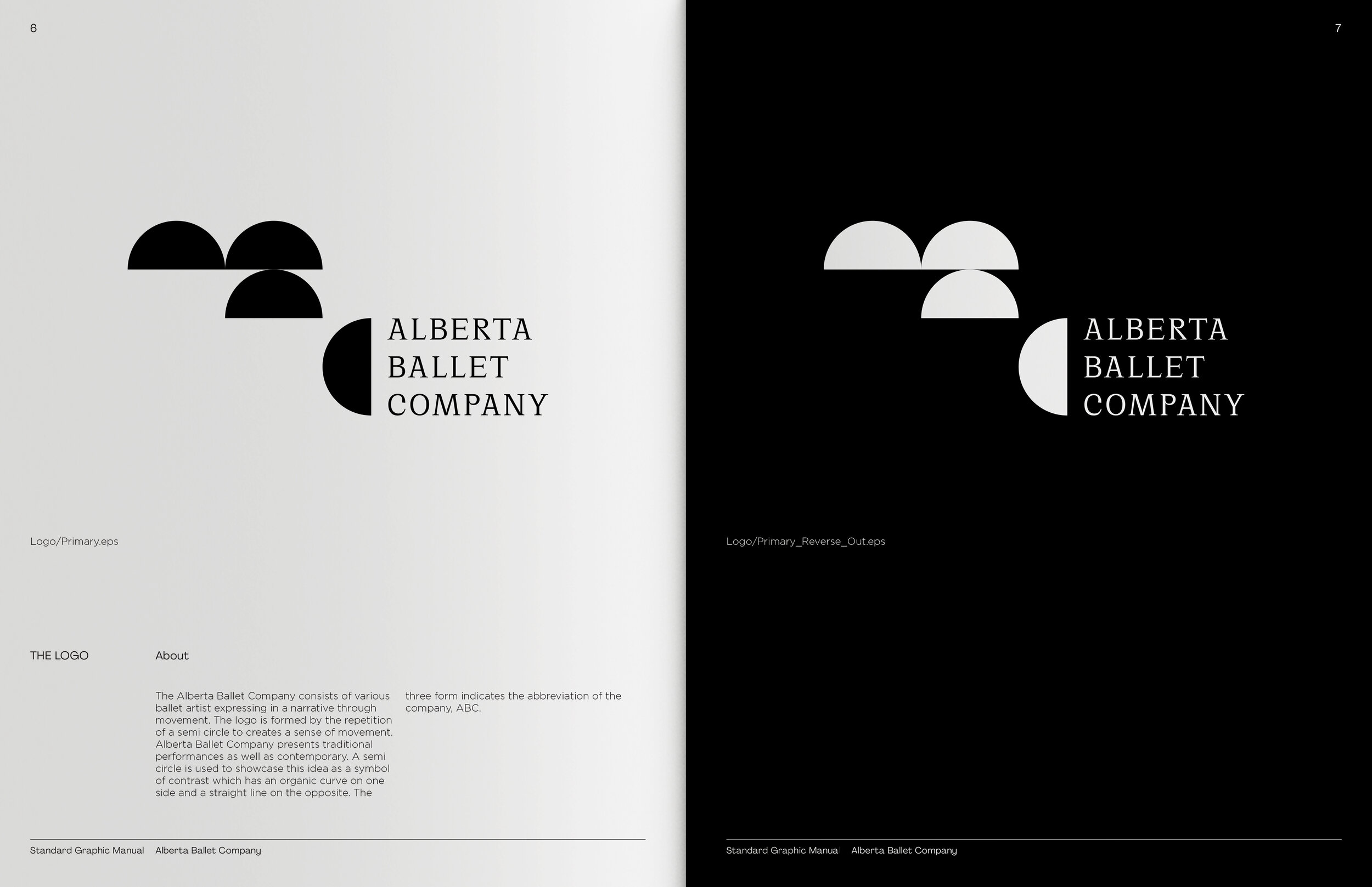
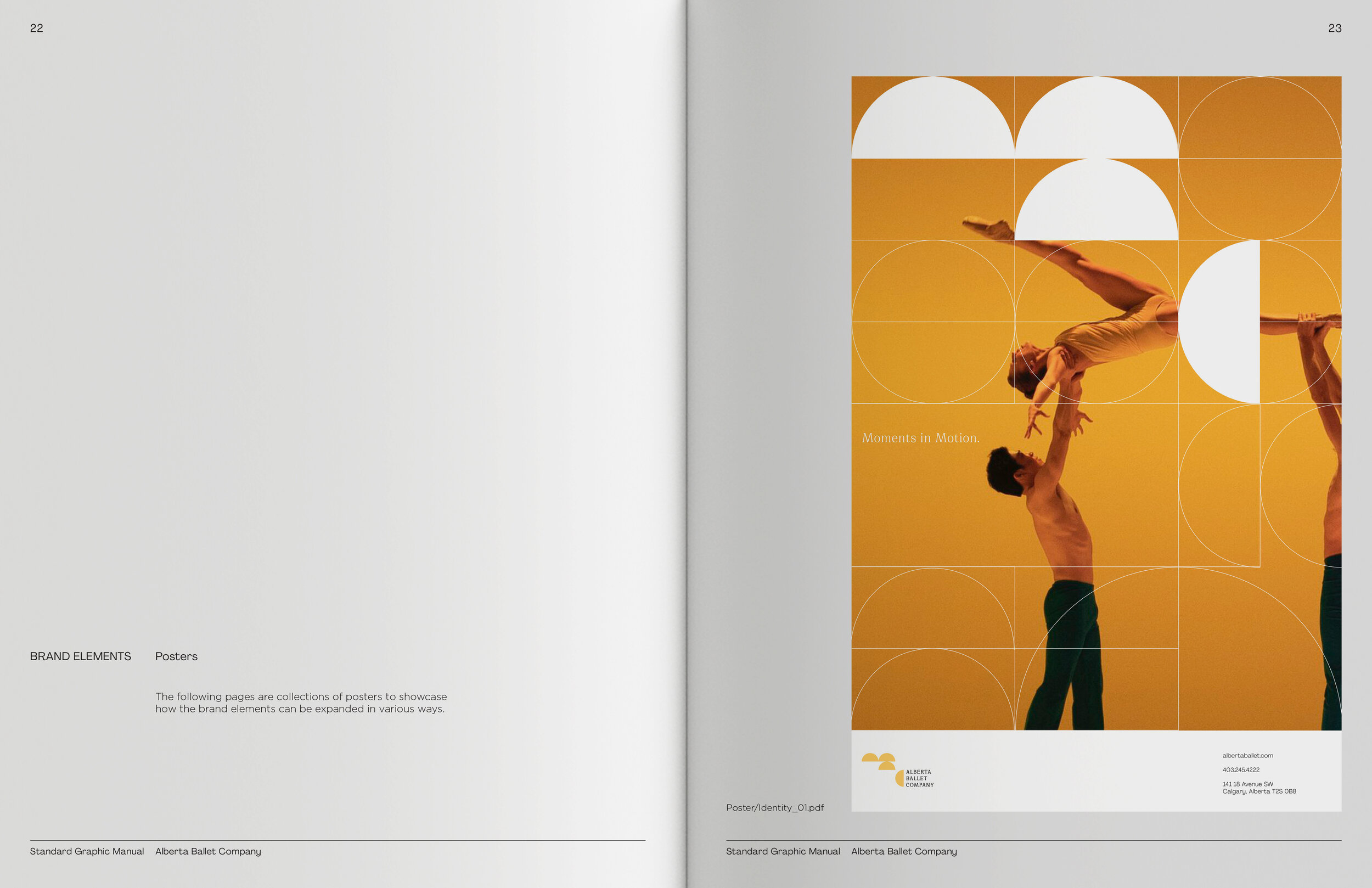
The logo is created by the repetition of the semi-circle. This sequence portrays the movement of the ballet dancers on stage. A semi-circle is used to showcase the idea of contrast with its organic curve on one side and a straight line on the opposite to reflect the contrasting performances
THE LOGO
The three forms indicate the abbreviation of the company, ABC, the start of an alphabet. This visual identity pushes for a new beginning for the company and an evolution for how we see the world of ballet.
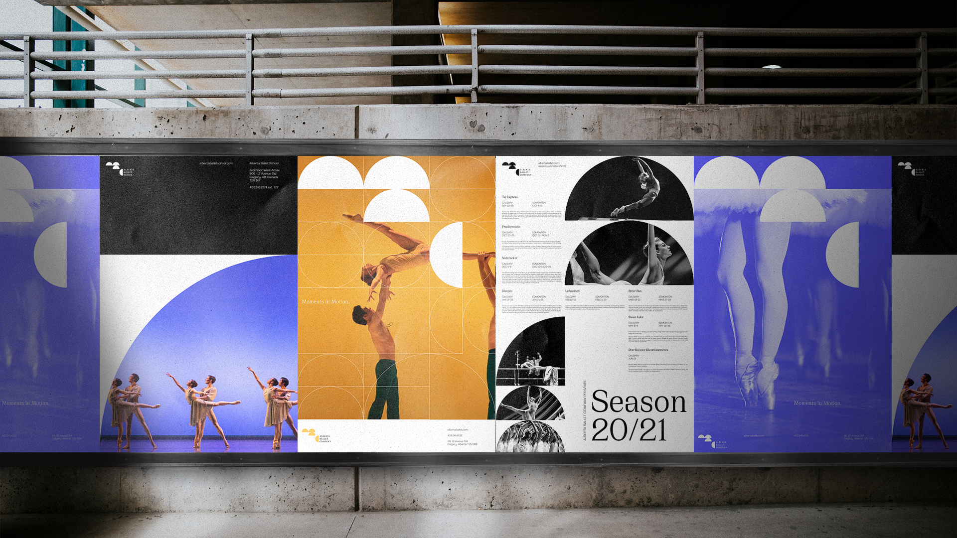
POSTERS
Company Identity Posters
![]()
![]()
![]()
![]()


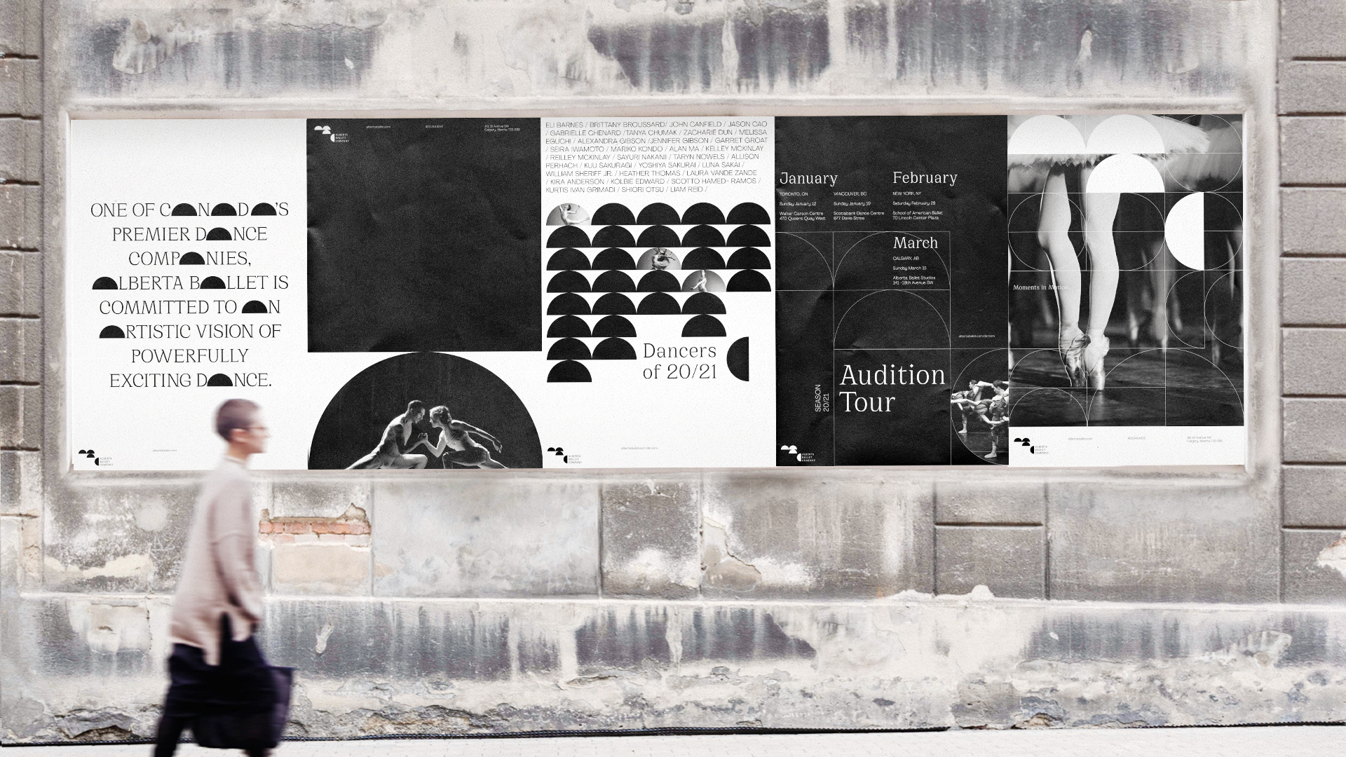
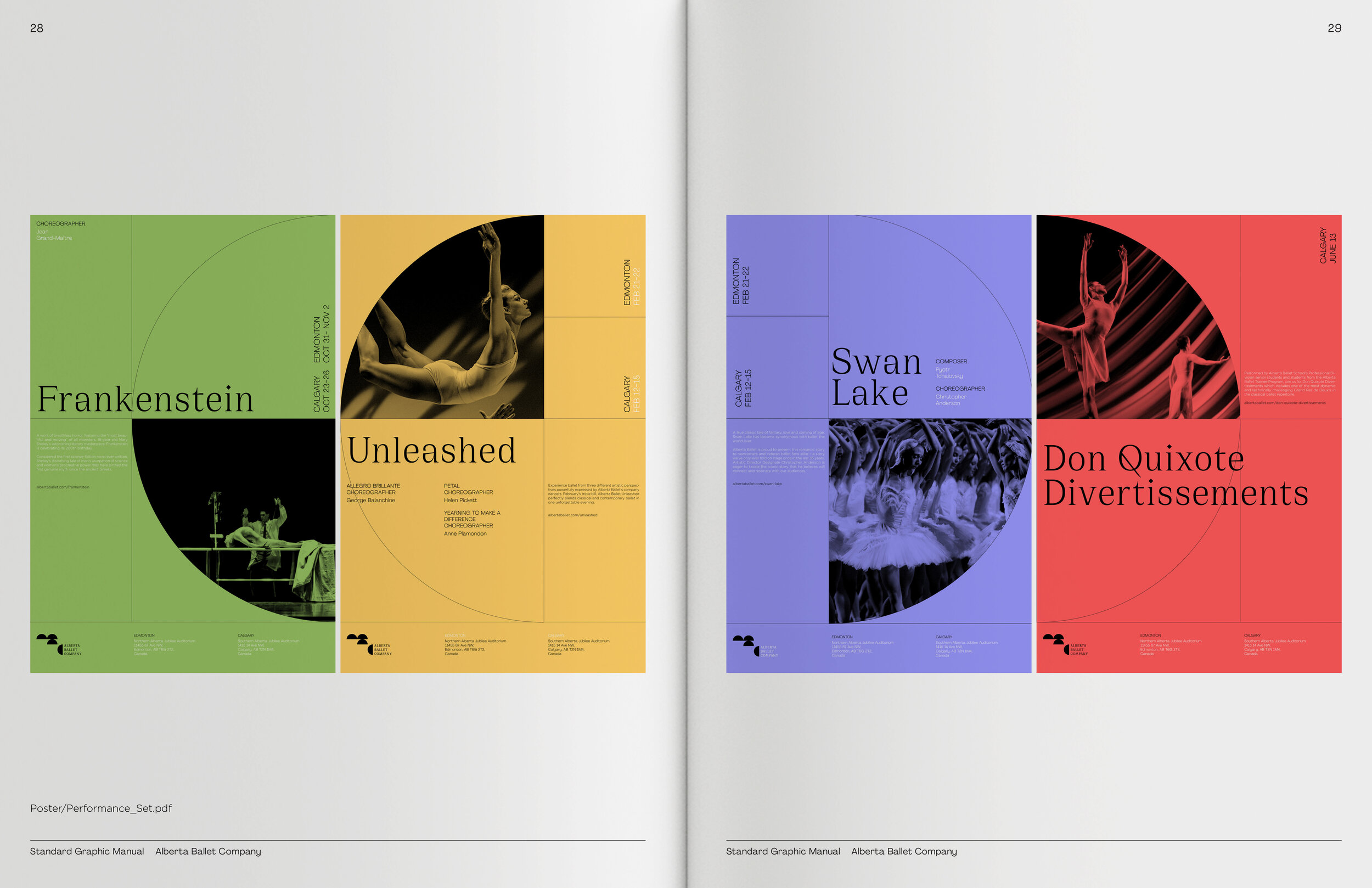
Individual Performances Posters
![]()
![]()
![]()
![]()


Additional Identity Posters and Event Posters
![]()
![]()
![]()
![]()


MOTION MONTAGE
BRAND ELEMENTS
 Secondary Graphic Elements
 The secondary graphics are composed of outlined foundational shapes. The shapes are to be used to choreograph various grids and are used on top of the images to visualize the tracing of movements.
 Brand Color Palette
The primary colors of the brand are Rich Black and Pure White. These contrasting colors mimic the theater of experience where there is transition between the anticipation of the darkness before a performance to the spotlight that highlights the art of the dancers. The Secondary Colors consists of four colors, Graceful Green, Balletic Blue, Energetic Red, and Harmonic Yellow. This wide range of colors was chosen to support the various expression that Alberta Ballet Company offers.
SOCIAL MEDIA
Instagram Stories (left), Instagram feed (right)

GRAPHIC STANDARDS MANUAL


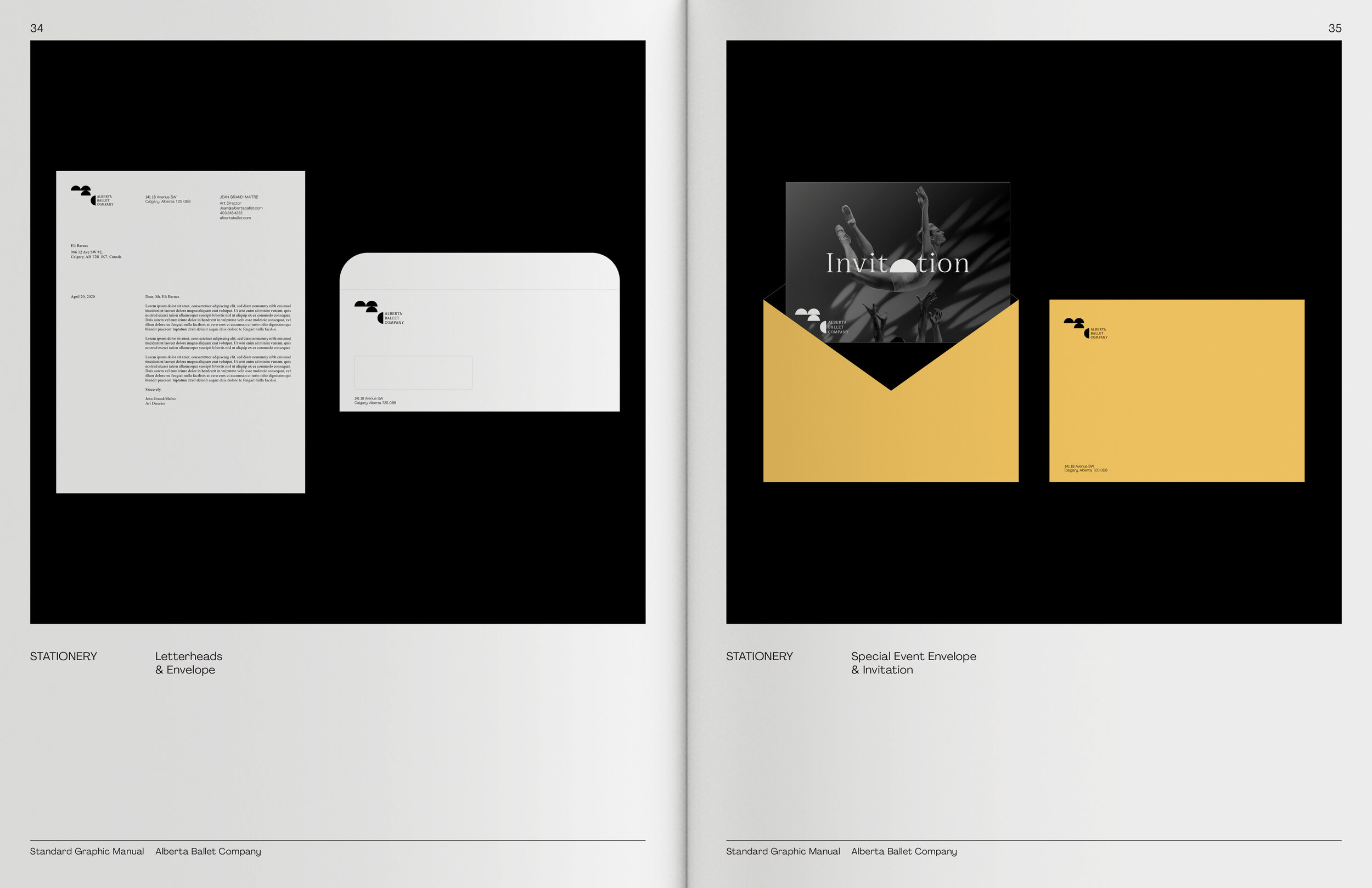
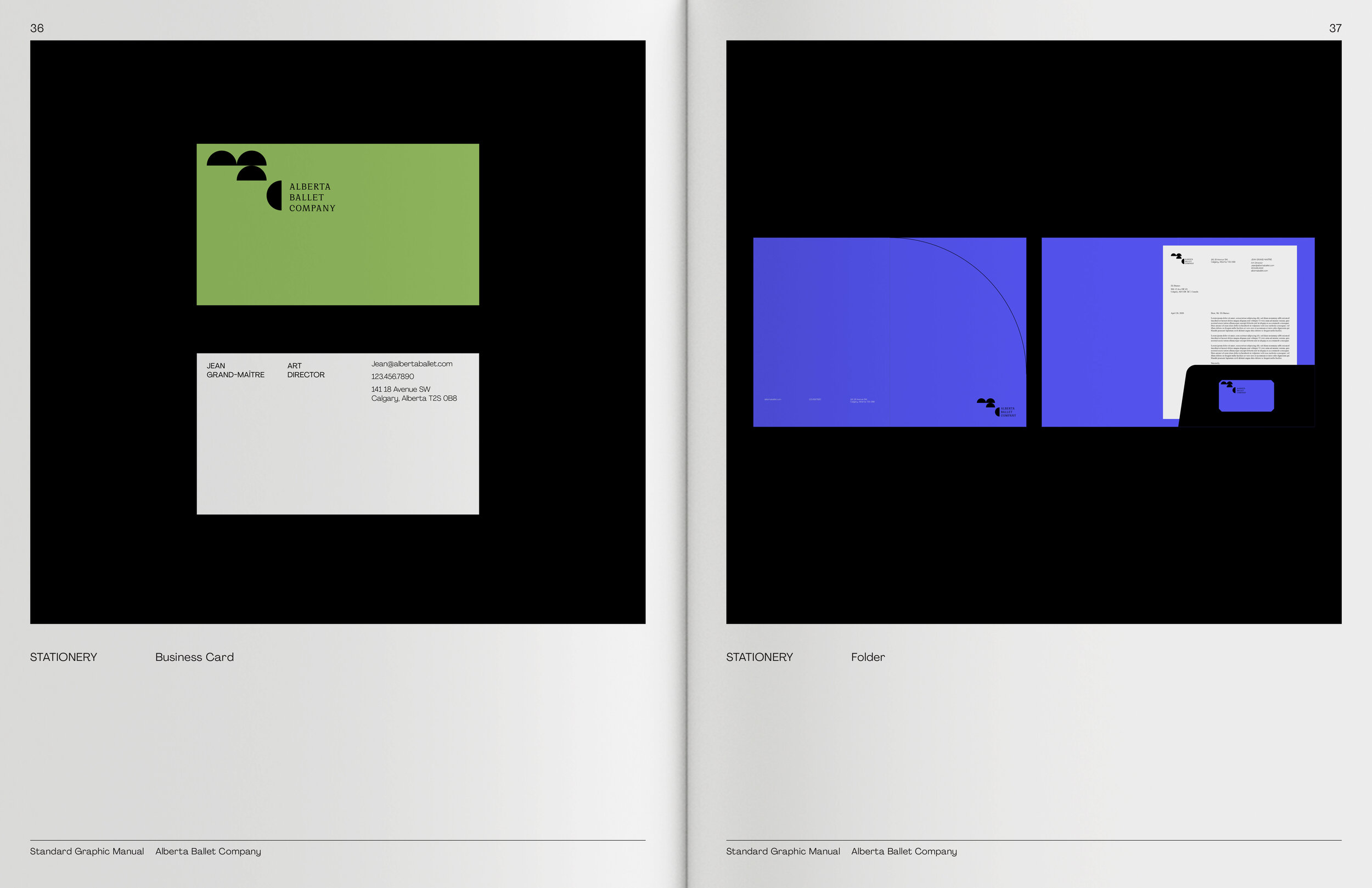

STATIONERY

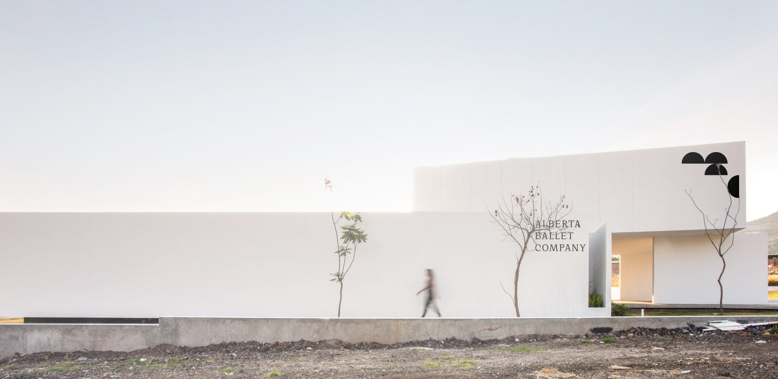
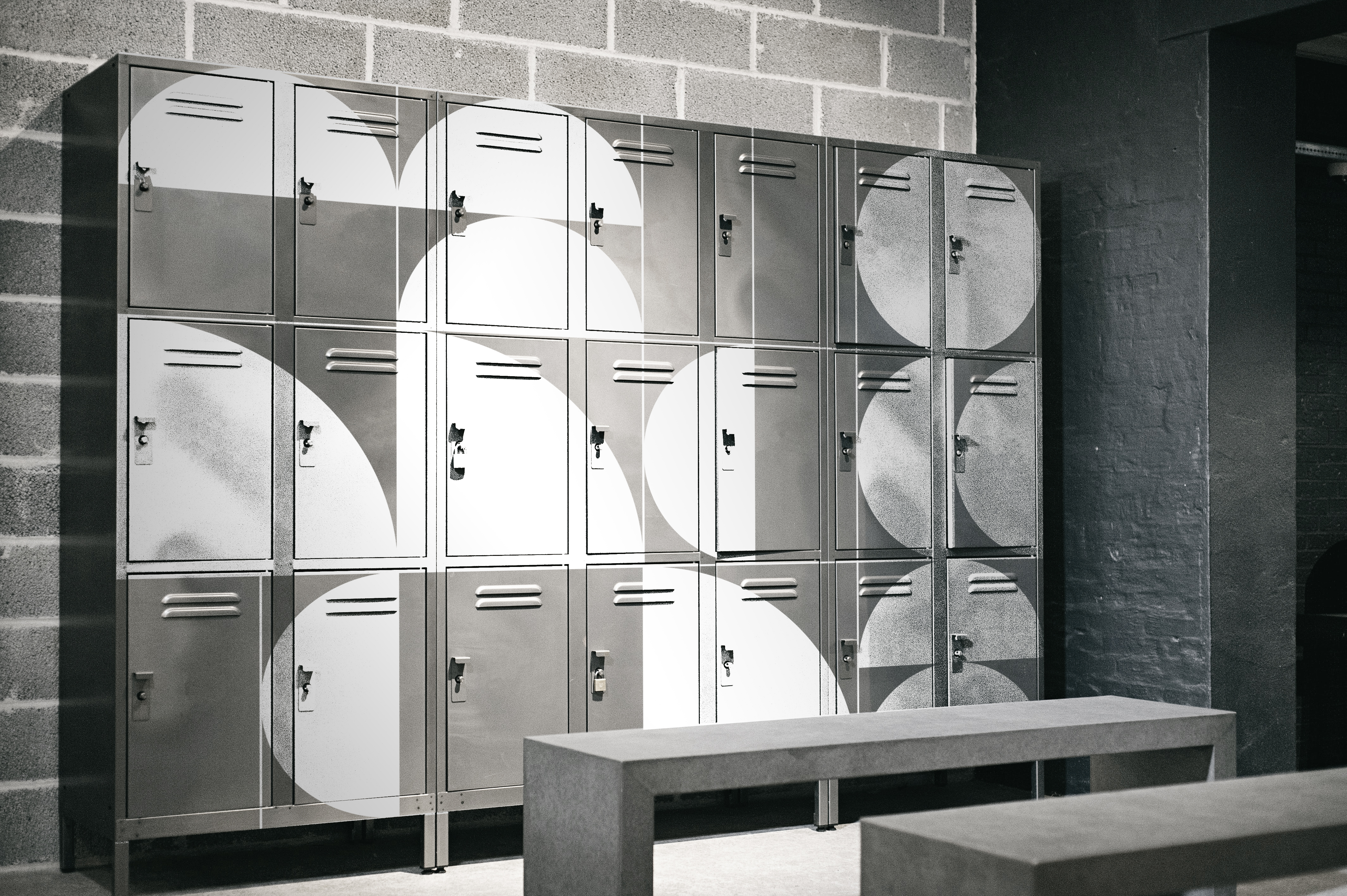
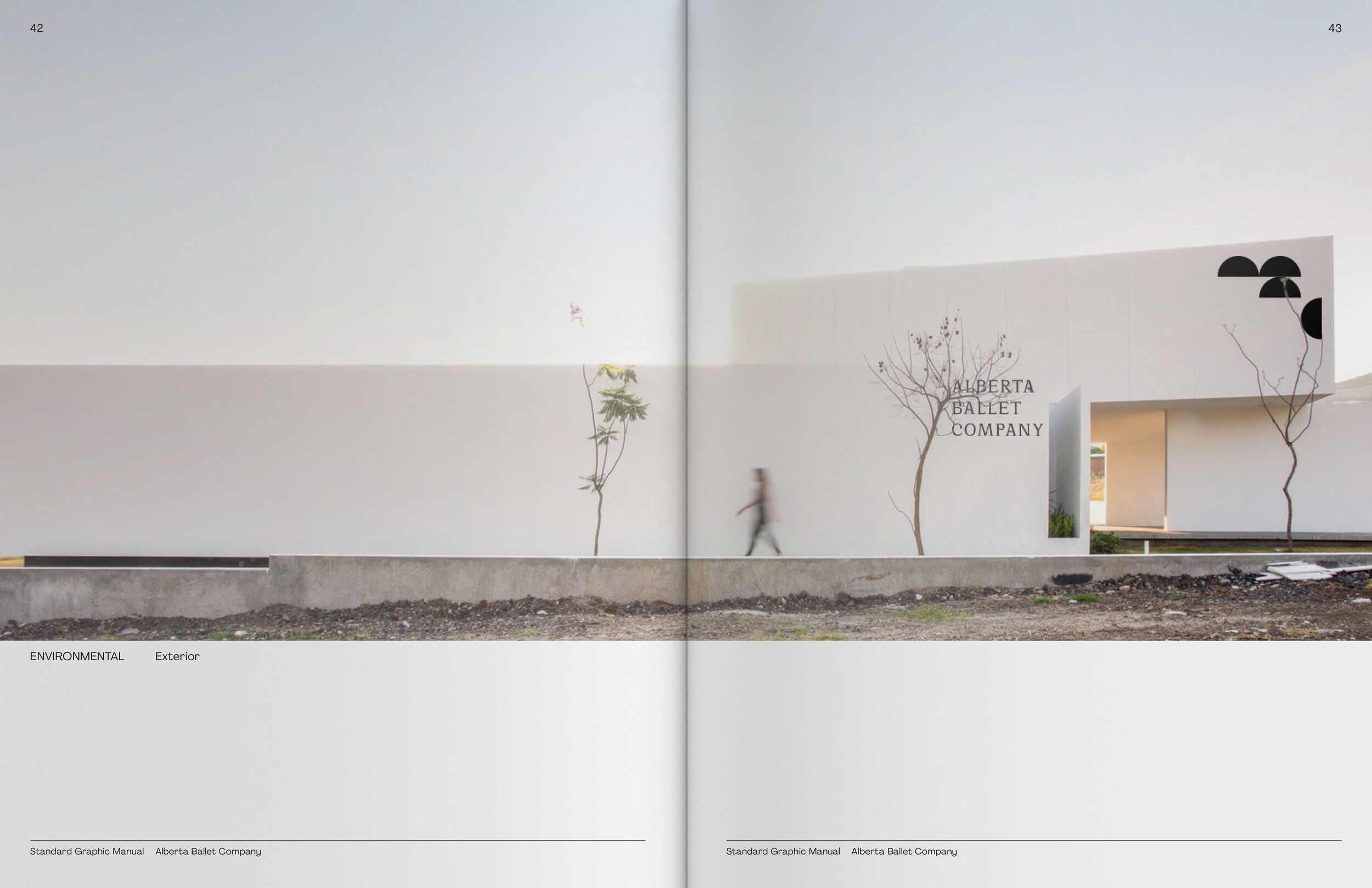
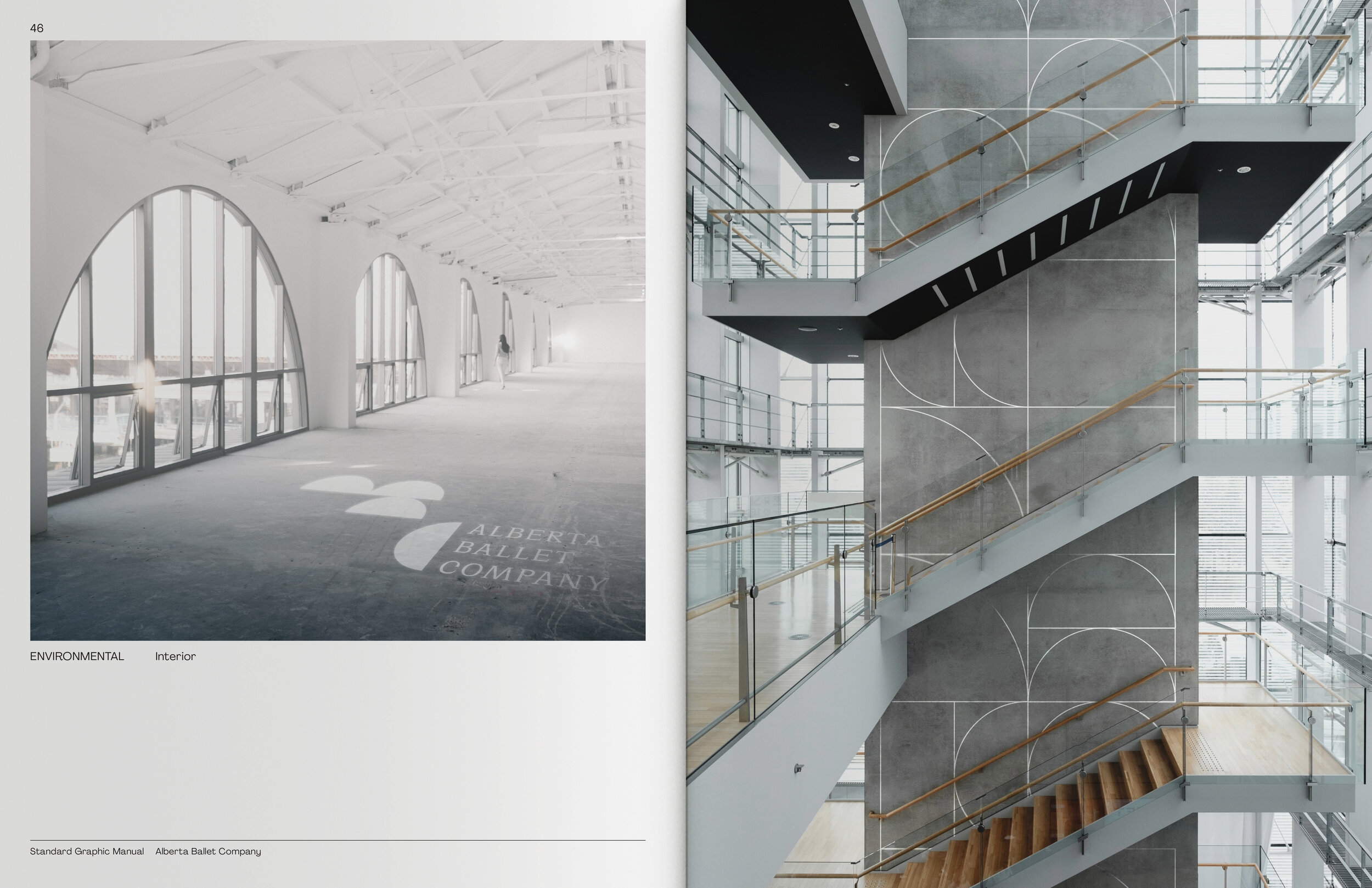
ENVIRONMENTAL APPLICATIONS